
Olive Academy – Educational Design & Branding
Overview
The Olive Academy's visual identity was designed to reflect the institution’s mission of nurturing confident, creative, and faith-rooted learners. The branding system combines modern educational aesthetics with symbolic elements representing growth, knowledge, and values-based learning.
Approach
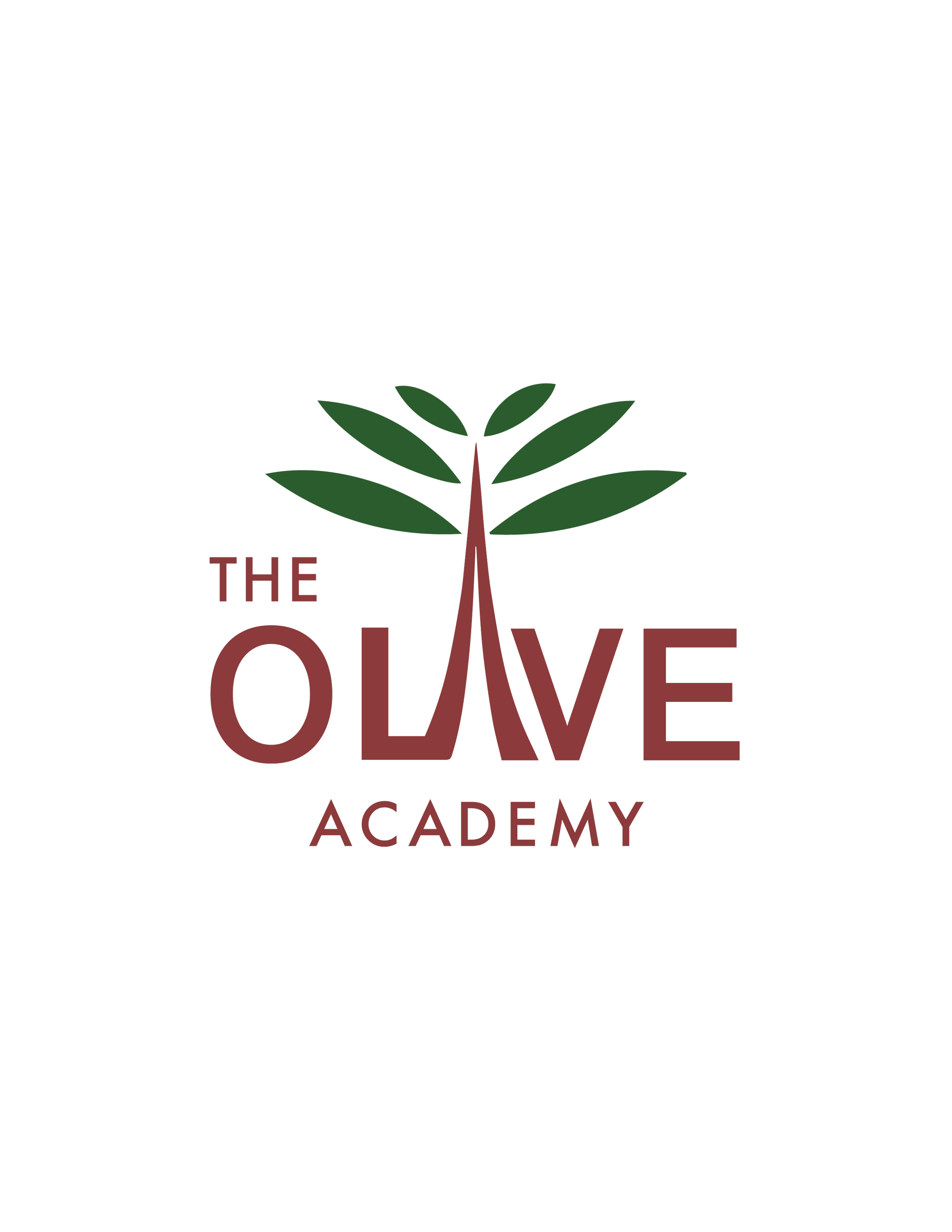
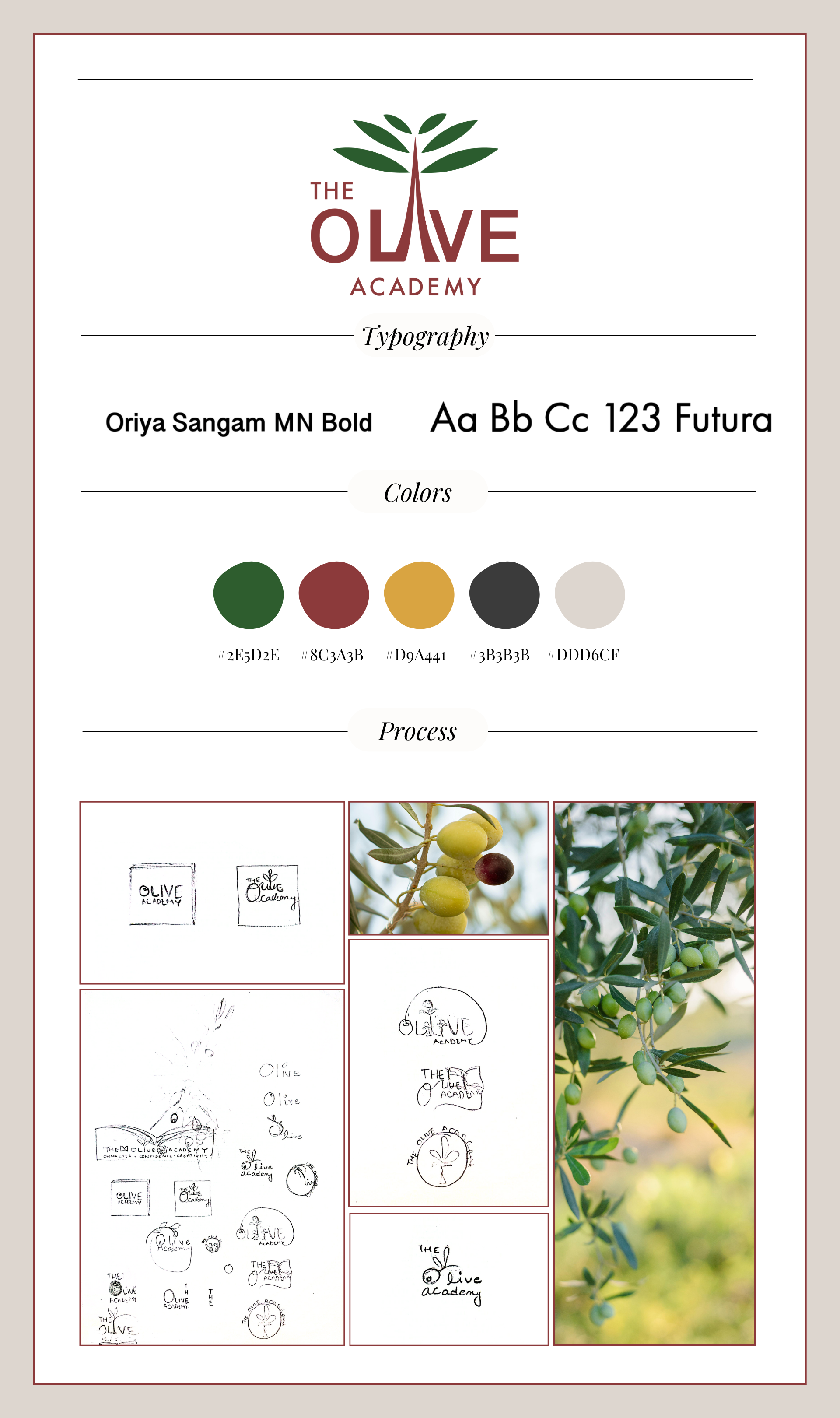
The logo features a stylized tree emerging from the letter “I” in OLIVE, symbolizing rootedness, growth, and upward movement. The upward-angled leaves reinforce ideas of intellectual and spiritual development while visually supporting the Academy’s holistic educational philosophy.
Typography combines Oriya Sangam MN Bold for warmth and approachability with Futura to introduce a modern, forward-looking structure. The color palette was intentionally selected to communicate harmony, strength, optimism, and sophistication through earthy greens, maroons, mustard tones, charcoal, and soft neutrals.
The project extended beyond logo creation into broader educational branding applications, including flyers, planners, and print materials designed to present information clearly for both students and parents.
Challenges
The primary challenge was creating a visual identity that balanced professionalism with warmth and accessibility. The branding needed to appeal to both educational and community audiences while maintaining clarity, scalability, and consistency across multiple print and digital touchpoints.