72 Lights-Brand Identity
Overview
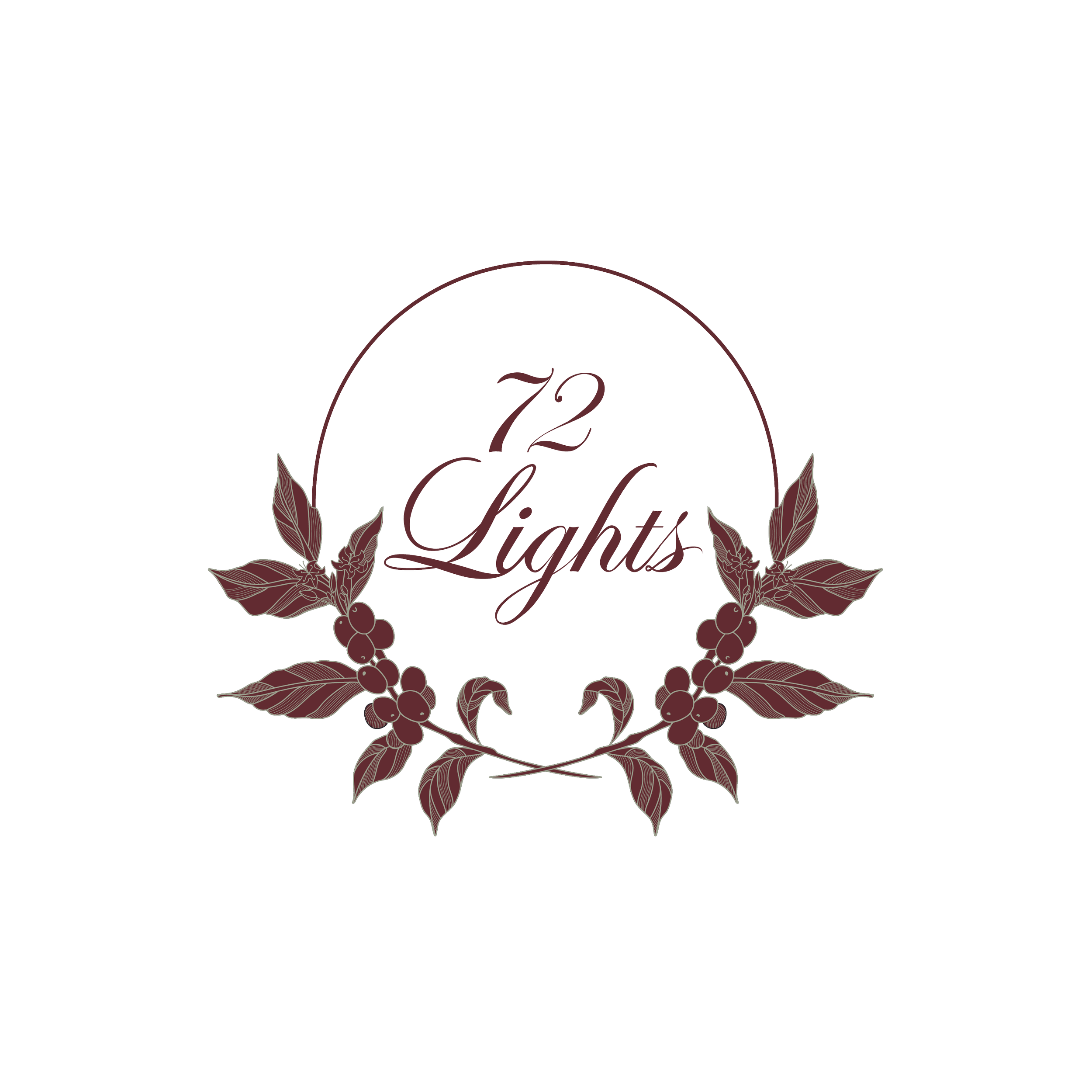
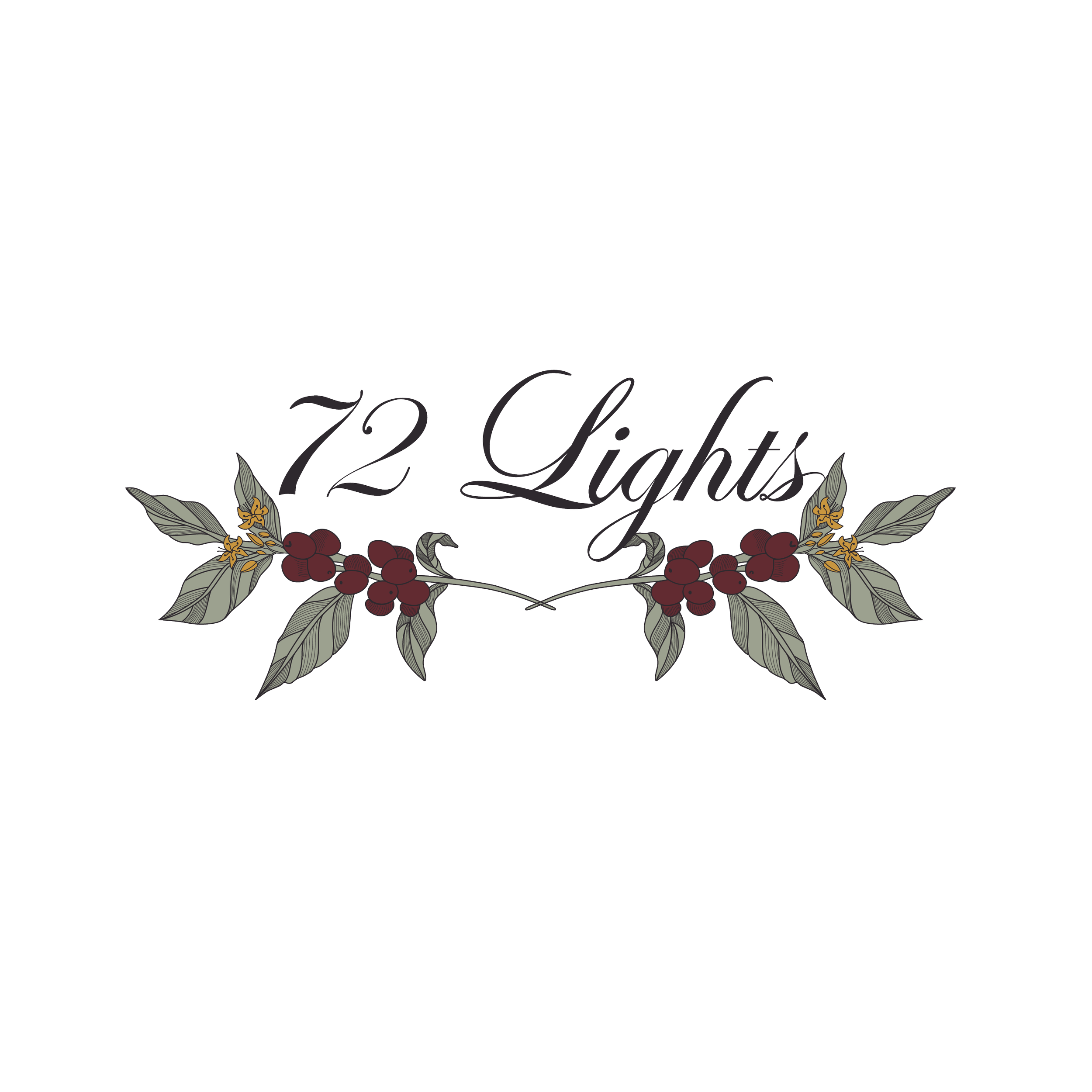
A refined visual identity created for a specialty mobile coffee cart focused on elegance, craftsmanship, and warmth. Rooted in Edwardian-inspired aesthetics and botanical forms, the branding system included both signature and emblem logo variations designed for versatility across packaging, signage, cups, menus, and digital applications while maintaining a timeless and sophisticated brand presence.
Approach
The identity explored the balance between sophistication and approachability through custom typography, botanical illustration, and muted earthy tones. Rather than relying heavily on traditional coffee imagery, the design incorporated coffee plant leaves, cherries, and subtle floral accents to create a more elevated and distinctive visual language.
Multiple logo variations were developed, including signature and emblem formats, to ensure adaptability across cups, signage, menus, and social media applications. Typography was customized from Edwardian Script ITC to create a more refined and recognizable brand presence aligned with the café’s understated elegance and intentional aesthetic direction.
Challenges
One of the primary challenges was maintaining readability and scalability while preserving the intricate Edwardian-inspired aesthetic. The client specifically wanted to avoid overt coffee imagery while still subtly representing the brand’s connection to coffee culture.
To achieve this, the branding incorporated botanical coffee plant elements such as leaves, cherries, and subtle floral accents rather than traditional coffee cups or beans, helping the identity maintain a refined and timeless aesthetic. Special attention was also given to line weight, composition, and simplified logo variations to ensure the branding remained clear, versatile, and functional across both large-scale and small-format applications.

White on Black Signature
2 Colors Emblem
Colored Version Signature

Simplified Emblem